While I'm in the process of getting this blog together, I thought to myself, how the heck am I going to write a blog if I have nothing done yet? I have so many projects that I want to try and share with all of you, but I don't even have pictures of my before shots. Guess I'd better get cracking!! My Kitchen Inspiration series is complete now, so make sure you check out part two and part three!!
I do know that lists have become my mainstay these days. With two young kids I find that writing everything down eases the hassle of remembering what to do next (shoot, I can't even remember the last thing I did, let alone who needs to go where and do what!) I've compiled a basic to-do-asap list for small things that I want to get accomplished over the next few months. They're relatively cheap and easy, so at least that's a start!!
Here’s part one of the kitchen portion of my long list:
2. Change my cabinet doors to glass inserts
Some things you really need to think through thoroughly when doing a kitchen remodel. I thought I got all of the nuances covered, but apparently I was wrong. Dead wrong! In hindsight, it’s truly minor, but I could kick myself for not going with my initial gut. I wanted to have a bank of my upper cabinet doors have panes, but last minute I chose to only go with the two corner cabinets having glass.
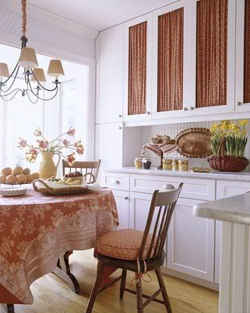
So, they look great! But, now I want the other two to have glass inserts as well, but I’m in a bind…you see, the interior of the cabinets are not “finished” as the experts would call it, and if I swapped out the existing doors for glass insert doors, you’d see the lovely brown interior. Yuck. Not ugly, but not pretty. Soooooo, now I have to brainstorm another idea. And, viola! Fabric inserts!!
Now, all I have to do is find the perfect fabric, order new doors, buy some tension rods or heavy duty staples (I don’t think I want to go the permanent route though) and get busy! To put me into motivational mode, here are my favorite fabric paneled cabinets.
Or, I could make it easy for myself and just do this…
As you can see from above, my kitchen is blue & white, my absolute favorite color combo!! I would love to find a fabric that matches my cute little plate display over my door, and of course, these lovely plates above!!!
3. Make the cabinets (even though they are semi-custom) look furniture-like

Stay tuned for more of my kitchen want list! There so much more we'll be here for ever!
Keep on keeping on!
*PS - Excuse the counter clutter, and if you're wondering what the heck are on my drawer fronts...that's my version of childproofing!! I didn't want to drill holes into the cabinets for the store-version locks! These are hair bands that are removable without permanent "scarification" of my cabinets!!!

Find me linked up at:

No Holding BackVMG206


LOVE LOVE the blue and white!! My kitchen is blue, white and grey. It looks so crisp, if that makes sense.
ReplyDeleteShelly
minettesmaze.blogspot.com
Blue & white is my absolute FAV!!! And yes, crisp is a great adjective!
DeleteA blue and white kitchen would be my choice. It's a fresh and clean look and just timeless. Good luck with your choice and can't wait to see what you decide to do! (Sharon)
ReplyDeleteThanks for sharing this post with us at the BeBetsy Brag About It link and hop. http://bebetsy.com and we hope to see you next week!
Sharon and Denise ♥
Follow us:
Facebook ~ Twitter ~ Bloglovin ~ Pinterest
Thanks gals!! I love blue & white so much!! I appreciate the opportunity to link up and will definitely be back for more!
Delete